Developing an iOS 7 Edge
1. Look and Feel: iOS 6 to iOS 7

IN THIS CHAPTER
- Focusing on Content, Depth, and Clarity
- Changes to Controls and Views
- Requirements for iOS 7
- Supporting iOS 6
- BepBop Sample Application
"In many ways, we've tried to create an interface that is unobtrusive and deferential. One where the design recedes, and in doing so actually elevates your content." - Jony Ive, Senior Vice President of Design, Apple
With iOS 7, Apple has adopted a new focus on content, depth, and clarity. iOS 7 has also totally changed the way views and controls look and feel. If you were around for the change from iOS 5 to iOS 6, you may remember that the changes to look and feel were relatively insignificant. That's most certainly not the case when going from iOS 6 to iOS 7. Some things are the same, but with iOS 7 a lot has changed especially in the appearance of buttons, labels, sliders, switches, segmented controls, alerts, and more. We'll take a look at the overall changes and what you'll want to do to make your iOS 6 apps feel at home on iOS 7. Then we'll see what's required for iOS 7. And lastly, we'll discuss what you need to do in your apps to support both iOS 6 and iOS 7.
Focusing on Content, Depth, and Clarity
Content, depth, and clarity are Apple's little words to describe major changes in iOS 7. When developing apps for iOS 7, the focus should be on the content, rather than on frivolous gradients, textures, and other visual effects. Apps should have depth, giving the user a better understanding of where they are and how to navigate their app. Content should be clear and easy to interact with when you focus on clarity. In essence, your UI should stay out of the way, give the user a sense of where they are and how to get around, and allow them to interact with the content they care about.
Apple has an excellent transition guide on this topic that goes into more depth than we'll cover here, so you should definitely read that as well. In fact, all of Apple's design resources on iOS 7 are useful, and if you're serious about developing for iOS 7, you should read them.
Content
Also referred to by Apple as deference, content is simply the information your user wants to see and interact with. To focus on content, you need to take great care in choosing what to place in front of the user. Anything that's unnecessary should be removed. iOS 7 is all about stripping away what's unnecessary and leaving only what's essential.
Depth
In iOS 7, Apple has also focused on adding depth to the operating system as well as to their apps. iOS 7 has adopted a focus on depth, which communicates hierarchy, position, and relationships between views to the user. For example, tapping on a folder on the home screen in iOS 7 zooms to a close-up view of the folder. Contrast this with folders in iOS 6, where they stayed at the same size but then additionally revealed the contents of that folder at a larger size. Here's a screen shot from iOS 7:
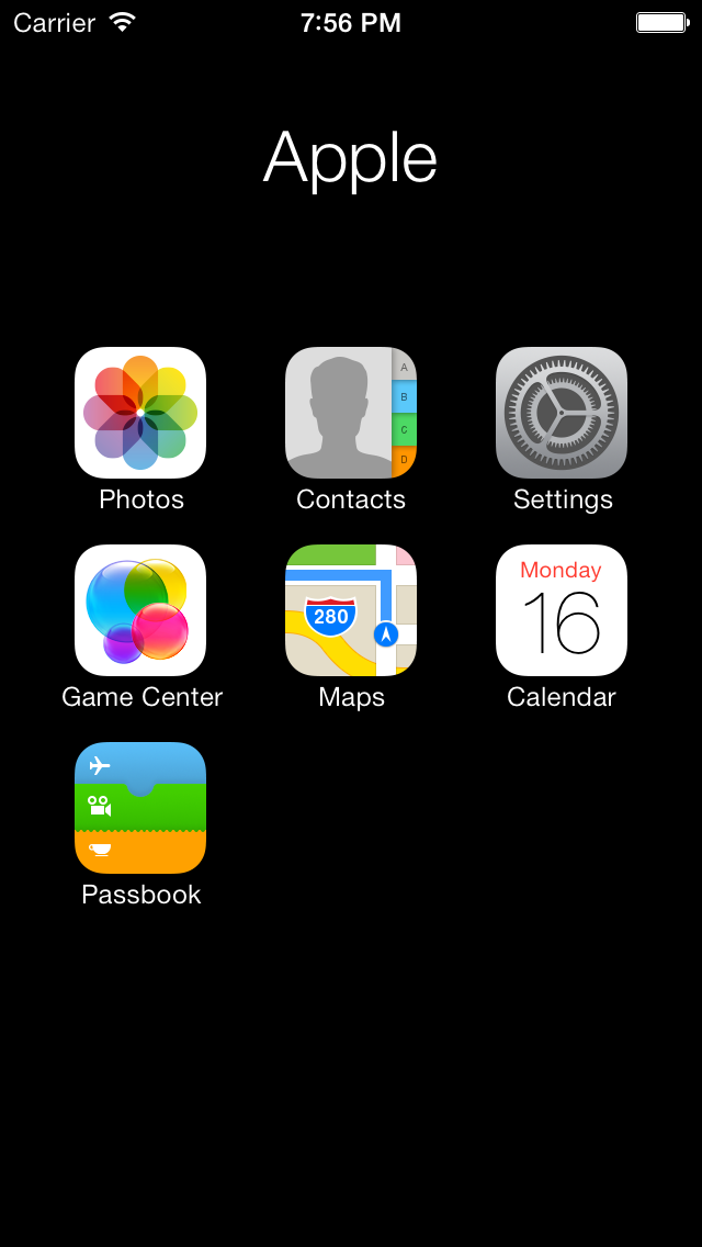
Notice that there's no thumbnail of the folder in iOS 7 like there was in iOS 6 - we just immediately zoom to the folder. Now take a look the folder on iOS 6:
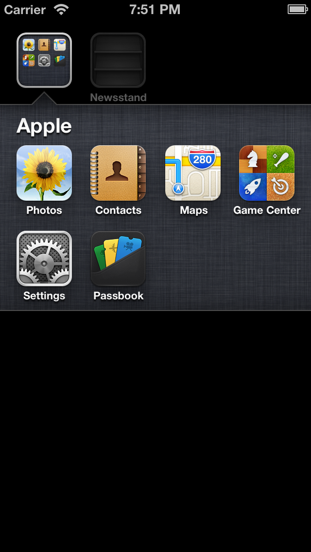
iOS 6 actually does have some depth here, since the folder is revealed from "beneath" the wallpaper, but iOS 7's depth feels more real thanks to the zoom animation. Apple's new Calendar app is a great example of what it means to add depth to an app. Let's take a quick look.

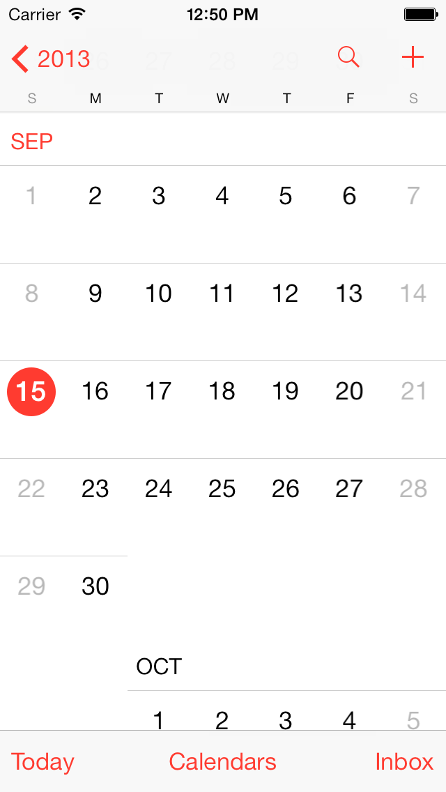
The iOS 7 calendar has a month view, pictured above, as well as a year view, a week view, and a day view. All of these are tied together, whereas the Calendar in iOS 6 had the same four views. In iOS 6, however, none of the views had any connection to each other - a segmented control was used to switch between List, Day, and Month views, and rotating the iPhone to landscape showed the week view. It lacked any sense of depth. After looking at Calendar in iOS 7, the iOS 6 version feels so disjointed, so flat, so lacking any sense of depth. The views have no connection to each other even though, logically, one might see how a month could be connected to a year. Let's take a look at the Month view from iOS 6.
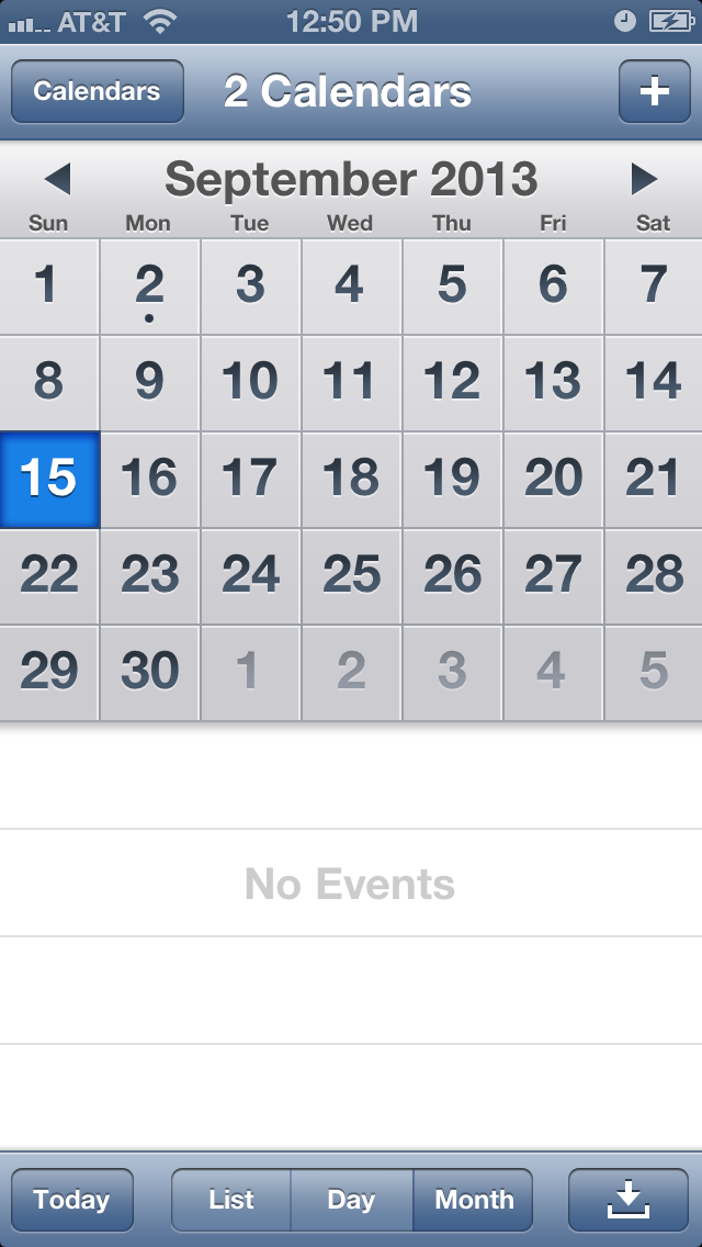
In the iOS 6 Calendar in the preceding screen shot, notice how the month view is totally separate from the list and day views. Unlike in iOS 7, you can't tap a day to go to the day view - you have to tap the Day button in the segmented control. This makes it difficult to show the day view for September 21, for example. It requires two taps - once on the date (21) and once on the Day button.
But iOS 7 changes everything. The calendar is now a navigation controller, starting at the top with a multi-year scroll view. The years are displayed in a larger font, with the months slightly smaller, and the dates even smaller.
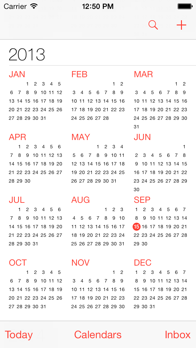
Tapping a month zooms to that month, showing a close-up of that month.
From here, tapping a date splits the weeks, revealing the day view.
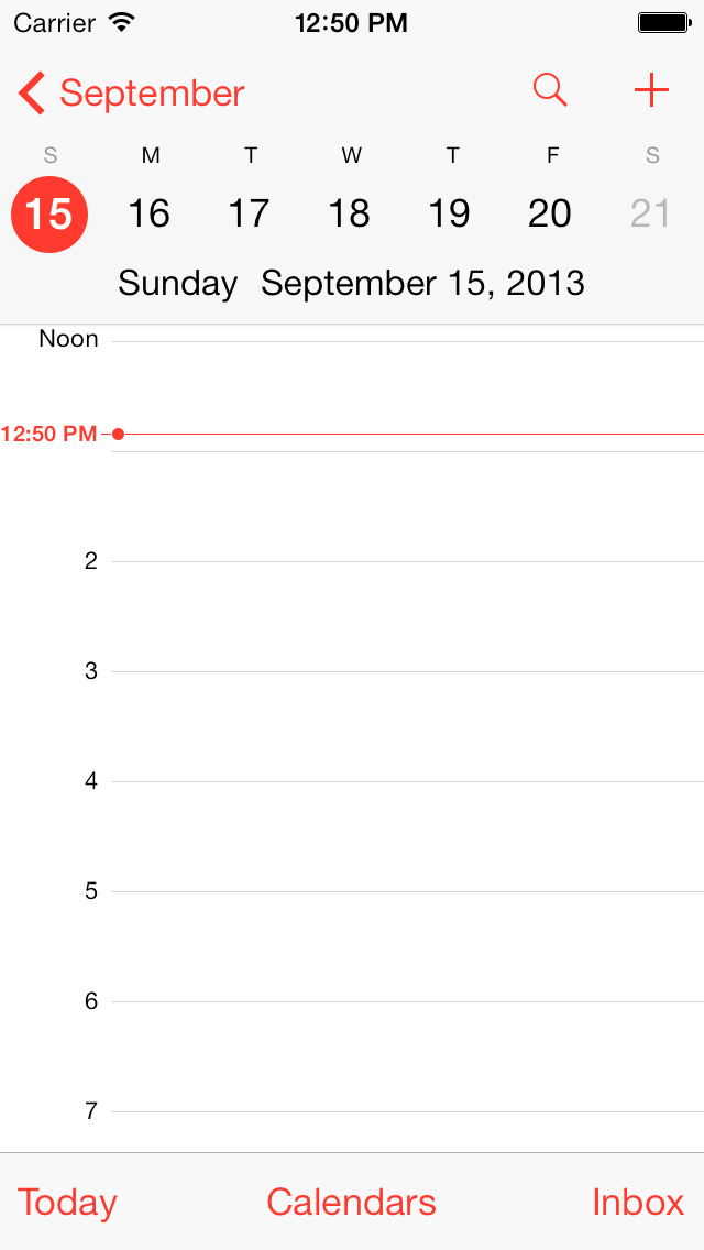
As you can see, Calendar in iOS 7 has depth. Tapping a month zooms to it, and tapping a day from there splits the weeks, revealing the day view as it seems to come from underneath. All of these transition animations give the calendar a feeling of depth. Views are no longer a conglomeration of disparate screens - they're all tied to each other with zoom animations and depth. Navigation controller animations are no longer slide-in-from-the-right only - there are plenty of other animations (such as zoom) that you can use to tie your views together. In Calendar, rather than immediately cutting to a new modal view, navigation is animated and views are related to each other.
Views that are related now appear to be related. Previously, the only relation from one navigation controller to the previous was subtle, even hidden, in the title of the back button. Now, navigation controllers can be related by being part of a bigger picture. We still have that back button title, but now we can do so much more. Calendar is an excellent example of this - it starts with a 30,000-foot view of years and smaller months and still smaller dates. But we can get closer just by tapping one of those months - we can bring it down to 10,000 feet and see each date and which days have events. We know how this relates to the previous screen not only by the back button title, but because we saw it zoom in. We know we're looking at a small part of the previous view - we can feel it. And that feeling is something we didn't have with iOS 6.
From the month view, we can tap a date to bring it in even closer and see the day view with the hours of the day marked and our events. And here, with iOS 7, we have yet another connection to the previous screen. We get a back button as navigation controllers have had since iOS 6, we get the animation like we had from year to month, and we also get to see the same view of the week we saw on the month screen. Notice that with iOS 7 the week is still there above the day. It helps to orient us, to show us where we are in the week. Contrast this with iOS 6, where the day view only shows the day. There's no link to the week, no bigger picture, no animation to orient us.
Clarity
Apple recommends focusing on clarity in apps in iOS 7. This means that apps should use negative space, use color to simplify the UI, use borderless buttons, and ensure legibility by using system fonts.
Using negative space means getting rid of superfluous things. Rather than having gradients, borders, and other things clutter the UI, just leave it empty. Include only what's essential to the UI, and leave the rest behind.
Color is a great way to simplify your app's UI and make it more clear. Buttons can be colored differently from the content of the app, indicating to the user that they're tappable, and color can be removed to indicate a disabled state. This is a radical change from iOS 6 where borders were used heavily to indicate that elements (buttons) were tappable. In iOS 7, the borders are gone, leaving color as the only indicator that the user can interact with an element on screen.
Dynamic Type, which we'll cover in a later chapter, can significantly improve clarity for users. Allowing the user to set their preferred text size and then adapting to it can make your app much more readable and usable for your users.
Changes to Controls and Views
With iOS 7, many of the standard controls have been updated with the new visual style that focuses on content, depth, and clarity. They're flatter, have more negative space, and are simpler than their iOS 6 counterparts. The simplest way to show these visual changes is, well, to show them. Let's take a look.
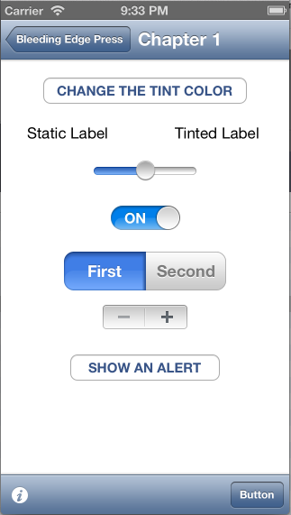
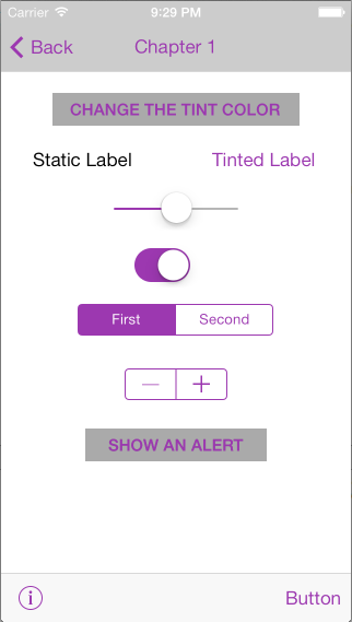
An example from BepBop
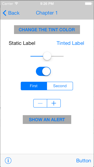
Here's a view with various controls running on iOS 7:
And here's that same view running on iOS 6:
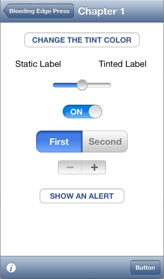
Notice how the controls on iOS 7 differ from those on iOS 6. The gradients have been removed, switches have been simplified, and segmented controls have a new visual style. Notice also how the navigation bar at the top and toolbar at the bottom have become much flatter with iOS 7 - the texture and gradients are completely gone.
Requirements for iOS 7
Many of the requirements for image assets have changed in iOS 7. Icon sizes have changed - for example, the icons on the home screen of a retina display iPhone are now 120x120 pixels, whereas in iOS 6 they were 114x114. The iPad home screen icon has also increased - it's now 152x152 pixels.
Supporting iOS 6
When making the decision whether to support iOS 6, first determine whether there's a business reason to do so. iOS users are quick to upgrade, so be sure to factor this in to your decision. Apple now posts useful data in the dev center about how many users are on the latest version of iOS, so if you don't have any data on your users, use this as a guideline.
If you've determined that you need to support both iOS 6 and 7, Interface Builder can help. It allows you to preview how your UI will look on both versions. To do this:
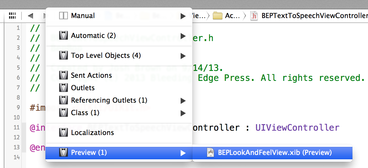
1. Open the Assistant editor. The button for the Assistant editor is in the top bar of Xcode, near the right side of the screen. It looks like this:

2. Click the Assistant pop-up. The Assistant pop-up is just to the right of the left and right (back and forward) arrows. In the screenshot below, it's the one labeled "Manual."
3. Hover over Preview and then click on your XIB file.
4. In the bottom-right corner of the preview, you can switch between iOS 7 and iOS 6 by clicking the iOS 7.0 and Later button.
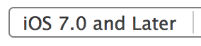
Use this button to switch between iOS 7 and iOS 6 to see how your view will look on each version of iOS.
The Sample Application - BepBop
In order to make the new look and feel of iOS 7 come alive, we have written up a fully functioning sample application called BepBop (pronounced BeepBop). The BepBop app runs on iOS 6 as well as iOS 7 and comes packed with examples showing many of the look and feel changes as well as many of the other new features in the iOS 7 SDK. Each of the subsequent chapters of this book will make reference to the BepBop app and all of the source code will be available on GitHub.
BepBop and iOS 6
When running the BepBop app on an iOS 6 device you will only see the examples from this inital chapter of the book since everything else in the app is only compatible with iOS 7. In order to achieve this we have conditional logic in the view controllers and custom UI controls that checks to make sure that the current device is either capable of performing a certain action or is explicitly an iOS 7 device.
Conditionally Displaying Content
To check for a certain capability we use the typical respondsToSelector: method wherever we do something that may not work on previous versions. For example, on iOS 7 the tintColor property has been elevated to UIView and is now available on all views and not just those controls that you could tint in iOS 6 (like UIBarButtonItem or UISwitch). The majority of the fun in the look and feel UI section is related to seeing this tintColor property in action. In order to make the code work on both iOS 6 and iOS 7, the BEPTintedLabel and the BEPTintedSwitch class check for the availability of the tintColor property.
0001:- (void) tintColorDidChange
0002:{
0003:    if ([self respondsToSelector:@selector(tintColor)])
0004:    {
0005:        self.textColor = self.tintColor;
0006:    }
0007:}
In other areas, we wanted to conditionally display different text or different data based upon the iOS version of the device that the BepBop app is running on. In order to achieve this, we added an IS_IOS_7 macro to the BEPAppDelegate.h that can be used throughout the app wherever the version of the device makes a difference. In the BEPAppDelegate.m we defined this method to support the macro.
0001:NSUInteger DeviceMajorVersion()
0002:{
0003:    static NSUInteger s_MajorDeviceVersion = -1;
0004:    static dispatch_once_t onceToken;
0005:    dispatch_once(&onceToken, ^{
0006:
0007:        s_MajorDeviceVersion = [[[[[UIDevice currentDevice] systemVersion] componentsSeparatedByString:@"."]objectAtIndex:0] intValue];
0008:    });
0009:
0010:    return s_MajorDeviceVersion;
0011:}
There are several places throughout the app that use the IS_IOS_7 macro to conditionally display different content - one example is in the BEPMainViewController where we optionally decide which chapters will be presented to the user based upon the type of device they are using.
Adapting the UI
The BEPLookAndFeelController in the BepBop sample app needed to be configured to run on both iOS 6 as well as iOS 7, and look decent on both platforms at various screen sizes. Since that particular UI does not utilize auto-layout a few small tweaks were required to get it looking right.
First, in iOS 7 custom buttons no longer have a background drawn for them and instead you can set a background color. On iOS 6, the button rendered with weird little gray corners underneath the system provided background image. In order to get this looking better, we conditionally set the backgroundColor property when the view loads.
0001:- (void) viewDidLoad
0002:{
0003:    [super viewDidLoad];
0004:
0005:    _showAlertButton.backgroundColor  = (IS_IOS_7 ? [UIColor lightGrayColor] : [UIColor clearColor]);
0006:    _changeTintButton.backgroundColor = (IS_IOS_7 ? [UIColor lightGrayColor] : [UIColor clearColor]);
0007:}
In addition to the button background, when running the app on iOS 6 the entire view was shifted down by the height of the status bar plus the navigation bar. Since the view is not within a UIScrollView, it was not automatically adjusted. In order to get the view rendering properly on iOS 6 and on iOS 7, we changed the view inset options in the BEPLookAndFeelView.xib to account for the difference in position.
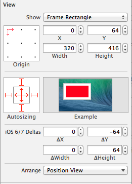
To get the right settings quickly, we were able to take advantage of the new Preview option that is built into the Assistant Editor. Which has options for displaying a xib as it will actually be rendered on iOS 6 and iOS 7 devices right within the Assistant Editor with no need to actually run the app. Who knew UI development could be so simple?
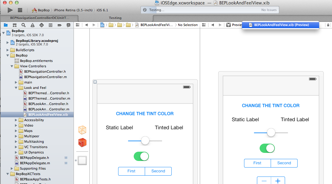
With those changes the app now runs on both iOS 6 and iOS 7, and displays pertinent content for each platform.
iOS 7 and TintColor
One of the major concepts that iOS 7 brings to the look and feel of apps is tintColor. The tintColor property has been promoted to a first class citizen on all UIViews and as such is available to be used to adapt the look of system controls as well as your own custom controls. Since the use of color in an iOS 7 app generally means that an item is interactive in some way, when a modal view (like a UIAlertView) is placed on top of the content, the tintColor property of the view is changed to adapt the UI below it so that it appears inactive.
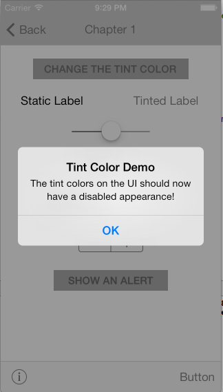
This treatment happens automatically and is propagated to all of the views in the view hierarchy. In the BepBop app there are two custom controls - BEPTintedLabel and BEPTintedSwitch - that utilize the tintColor property to also adapt the UI when the main tintColor property changes. This is achieved by implementing the tintColorDidChange method in each to provide special behavior. In the BEPTintedSwitch class the tintColorDidChange method is used to change the onTintColor from the default green to the current tintColor of the UI.
0001:- (void) tintColorDidChange
0002:{
0003:    if ([self respondsToSelector:@selector(tintColor)])
0004:    {
0005:        self.onTintColor = (self.tintColor ? self.tintColor : self.superview.tintColor);
0006:    }
0007:}
0008:
0009:- (void) setTintColor:(UIColor*)tintColor
0010:{
0011:    [super setTintColor:tintColor];
0012:    [self tintColorDidChange];
0013:}
The UISwitch tintColor property behaves slightly different than other controls, so in this class we also had to override the setTintColor: method to make sure that the BEPTintedSwitch behaved the way that we wanted. There are a few more tidbits in the BepBop app that you can explore like the BEPThemedViewController which adds a themed title view to the navigation item as well as the BEPNavigationController which allows individual view controllers to specify which status bar style will be used when it is pushed onto the stack.
Summary
In this chapter we have covered content, depth and clarity in iOS 7. We have also looked at the comparisons between iOS 6 and iOS 7, while focusing on these differences in our BepBop application. In the next chapter we will get our feet wet with dynamic animations in iOS 7.