Developing a D3.js Edge
6. Plugin Example

- Introduce a set of real world data
- Implement a visualization of real world data with the reusable API
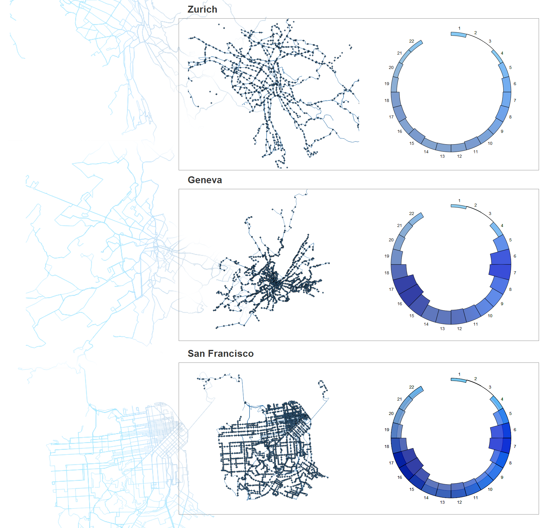
We have now covered the basics of how to implement the reusable API, seeing first hand the benefits of using it. It is now time to look at a real world example: in this case, a dataset provided by a challenge from Urban Prototyping. The data will be used to provide valuable insight into the transportation challenges of three major cities around the world: Geneva, Zurich, and San Francisco. The organizers of the challenge have provided geographic data and key metrics for transit routes throughout the cities.
This data set provides several dimensions that we wish to explore. We have geographic data, time data, and several metrics provided at each transit stop. A data set like this lends itself to multiple, linked visualizations. We've chosen to use a map to illustrate the geographic dimension, and a radial histogram to simultaneously visualize the time dimension and stop metrics. An impression of the final product can be seen in the figure below.
Why A Reusable Approach?
This challenge provides a perfect opportunity to implement the reusable API, since it poses several challenges and issues that a reusable API can address.
The most obvious issue is the fact that we have to recreate our visualization three times, once for each city. If we were to duplicate the code to produce each visualization three times, our code would quickly become unmanageable and bloated. For example, if we wanted to make a change to the map for each city, we would have to implement this change three times. With the reusable approach, we can create a reusable map module and make an amendment to the module, and the change will be propagated through every visualization.
Next, we have fairly large data sets (> 50 megabytes) that can be cumbersome for the browser to deal with efficiently. These data sets take a long time to load, require some post-load cleaning, and filtering them natively can be tedious. There are several libraries that make this task easier. We can define a reusable module to deal with these tasks for each of our three data sets, and integrate these libraries within the module to abstract this process for our custom API.
Finally, to tie everything together, we need some custom events that allow us to respond to data loading events, hovering events, zooming events and brushing events. By implementing these into our reusable modules, we are able to simplify this process across all three visualizations and create a common interface within every visualization.
Before any of this can begin, however, we first need to define our requirements.
API Requirements
The first step in developing a reusable API is to define the requirements it should meet, along with any expectations you may have.
We want an application that can efficiently visualize a large, multi-variate data set, linking key dimensions for an all encompassing view of the data. In addition, it should be highly adaptable, keeping a simple API to encapsulate an implementation smart enough to handle very different configurations. This will allow us to simply modify the input data, and have the visualization update accordingly. From this, we have an API that must:
-
Efficiently load and clean large (> 50 megabyte) data sets.
-
Summarize the data using third-party libraries.
-
Produce a map of the geographic data.
-
Produce a radial histogram of the time, and stop metric data.
-
Link the map and radial histogram to the transit stop data.
- Be straightforward to adapt to new input data.
Now that we understand what is required of our API, we can begin the process of defining it.
Breaking The Application Into Modules
Now that we have specified the requirements of our reusable API we can begin the next step of breaking it into specific modules. With a complex visualization like this, it's often best to start simple and take some time to think about how to break the visualization into smaller pieces. For our example we know we need to:
-
Load the data into the browser and apply some data cleaning.
-
Generate a map of each city to visualize the geographic dimension.
-
Generate a graph to visualize key metrics about various stops.
-
Link the two visualizations together to allow dynamic data exploration.
Accomplishing all of this without using the reusable pattern would be a monumental task, but fortunately, the reusable pattern dramatically simplifies this process. Let's take a look at how to get started.
Cleaning The Data
Visualization is more than rendering graphics. It often starts with a human having a question. The data is a mediary between the human and the object of the study. Visualization will help to extract knowledge from this data. But first, the data should be good at representing the object to study. Collecting, storing, cleaning transforming, and computing statistics are the important steps for preparing a good visualization. Most of the D3.js examples you can find on the web come with clean data, or even generated data. But, as with most data you will encounter in real life, the dataset for our example required some cleaning before it could be used.
![]() The cleaned data can be found on the github repository that also contains the source code for this book: all data sources are located in the
The cleaned data can be found on the github repository that also contains the source code for this book: all data sources are located in the data/ directory tree.
To visualize a dataset using D3.js, go through the following steps:
- Collecting
- Loading a data file or connecting to a data source (i.e., using
d3.json) - Cleaning (i.e., joining, denullifying, standardizing, formatting, using simple Array an Object methods or specialized tools)
- Converting the data to the right structure for a D3.js layout (i.e., CSV to matrix, flat JSON to hierarchical using
d3.nest) - Mapping from data to layout space (i.e., using
d3.layout.stackto inject some layout information to the dataset) - Binding data to the DOM object (i.e., using
d3.selectAll().data()) - Mapping from layout to pixel space (i.e., using
d3.scaleto map from layout space to pixel space) - Render graphical attributes in the DOM using this prepared data (i.e., using
d3.attr)
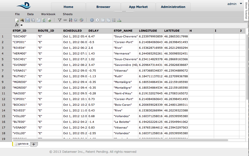
As previously mentioned, the Urban Data Challenge dataset needed some cleaning and processing, which is most often the case in real-world scenarios. For example, the San Francisco dataset had the real-time and scheduled bus arrival time in two different files, unlike the Geneva and the Zurich dataset. So, to compute the bus delay, the files had to be joined, even if no join index was readily available. The Geneva dataset also needed a longitude and a latitude column, which were only available in the geojson files. Time filtering and removing null values are typical operations for cleaning data that we had to perform. Specialized tools like OpenRefine, or generic tools like LibreOffice Calc, are often used for this. The file was too big for loading into Calc or Excel, so we used Datameer, a spreadsheet-based analytics tool for BigData. Although Datameer was developed specifically for huge datasets (like petabytes of data from Hadoop clusters), their filtering, joining, grouping and more than 200 analytics functions make it a good candidate for the task (full disclosure: one of the authors is a Datameer developer).
D3.js can load dirty data and clean it on the fly. But for a dataset totaling 180 MBs over 3 files, reducing it to 60 MBs of clean data was still heavy loading with Ajax. We could have reduced the file size more by using just a subset. But once gzipped, the data size was acceptable for this demo application. And it is a good illustration of a typical bottleneck in the visualization process, especially for online applications, which has to be solved with tools outside of the D3.js ecosystem.
Summary
Now that the data sets for each city have been cleaned up and contain similar fields that allow for comparison, we can implement the reusable pattern to construct a useful visualization that allows for exploration of the data, which we will do in the next chapter.