Developing a D3.js Edge
12. Radial Histogram API
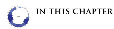
- Understand the Radial Histogram API
- Implement the Radial Histogram into our application
![]() The source code and data files are available in the
The source code and data files are available in the code/Chapter12/ directory tree.
The idea for a radial histogram came about after grappling with the best way to simultaneously visualize a time dimension and an aggregation of the stop metrics we were provided in our example. Because time is cyclical, a radial layout allows us to "bin" the data easily into 24 segments, one for each hour of the day. Each segment's inner radius is proportional to the value of the metric we pass into our module. The metric of most interest for us was the number of times the bus, or buses, were delayed in each individual hour. This allows us to get a picture of peak hours very quickly. The end result looks something like this:
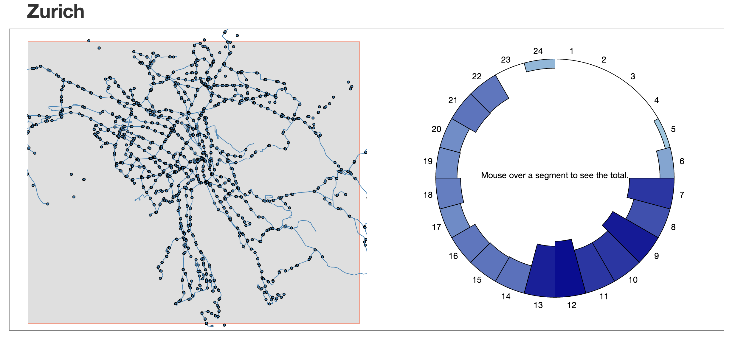
With this visualization we are able to quickly tell when and where most of the delays occur. By brushing over the majority of a map we can get an overall snapshot of when the delays occur for all stops. In the image above it is very apparent that the majority of the delays for all of Zurich happen between the hours of 7 AM and 1 PM. This visualization allows us to pinpoint specific areas of the city with the brush. Take the following example:
Making the Visualization Reusable
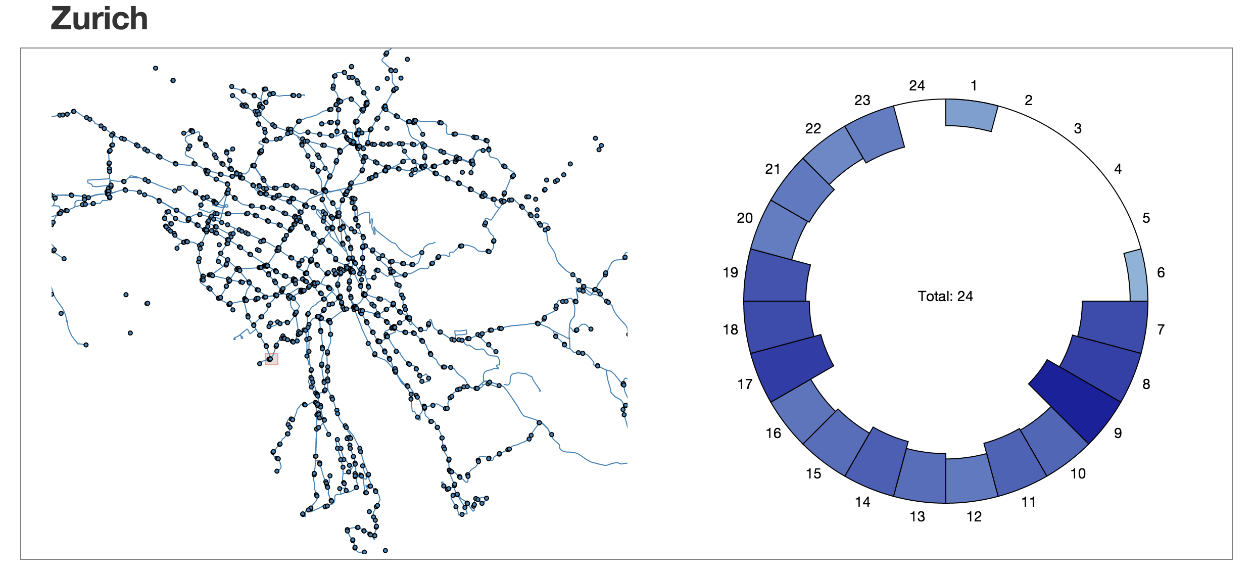
In this example we have brushed over a very small region of Zurich, encompassing only a few stops. The radial histogram here shows that the majority of the delays happen during rush hour, suggesting that perhaps these few stops are mostly used by work commuters. Let's see how we made this visualization reusable.
Just like with our map module we setup the defaults, the selection function, and the getters / setters:
001:d3Edge.radialHistogram = function module () {
002:    var slices = 24, // 24 hours in a day.
003:        innerRadius = 100, // Default inner radius
004:        outerRadius = 300, // Default outer radius
005:        innerScale = d3.scale.linear(), // Define a scale for sizes segments based on value.
006:        group, // Our empty group variable
007:        dimension, // Our empty dimension variable.
008:        offset = 50, // Label offset value.
009:        lowerColor, // The color used for the minimum of our range
010:        upperColor, // The color used for the maximum of our range
011:        innerRange, // The lower bound for radius value
012:        outerRange, // The upper bound for radius value
013:        color = d3.scale.linear(); // Linear color scale used for the segments.
014:    // The chart function our module will return with the selection that called it,
015:    // as the only argument.
016:    function chart (_selection) {
017:    }
018:    // Method to get/set the inner radius.
019:    chart.innerRadius = function (_innerRadius) {
020:        if (!arguments.length) return innerRadius;
021:        innerRadius = _innerRadius;
022:        return chart;
023:    };
024:    // Method to get/set the outer radius.
025:    chart.outerRadius = function (_outerRadius) {
026:        if (!arguments.length) return outerRadius;
027:        outerRadius = _outerRadius;
028:        return chart;
029:    };
030:    // Method to get/set the crossfilter group.
031:    chart.group = function (_group) {
032:        if (!arguments.length) return group;
033:        group = _group;
034:        return chart;
035:    };
036:    // Method to get/set the label offset.
037:    chart.offset = function (_offset) {
038:        if (!arguments.length) return offset;
039:        offset = _offset;
040:        return chart;
041:    };
042:    // Method to get/set the crossfilter dimension.
043:    chart.dimension = function (_dimension) {
044:        if (!arguments.length) return dimension;
045:        dimension = _dimension;
046:        return chart;
047:    };
048:    // Method to get/set the color range.
049:    chart.colorRange = function (_array) {
050:        if (!arguments.length) return [lowerColor, upperColor];
051:        lowerColor = _array[0];
052:        upperColor = _array[1];
053:        return chart;
054:    };
055:    // Method to get/set the radial range.
056:    chart.radialRange = function (_array) {
057:        if (!arguments.length) return [innerRange, outerRange];
058:        innerRange = _array[0];
059:        outerRange = _array[1];
060:        return chart;
061:    };
062:    // Finally, return the chart.
063:    return chart;
064:};
Creating the Visualization
This takes care of the basics for our module. Now we just need to work on the code that will execute on the d3.js selection and actually create the visualization. This is the code that will be executed every time we call our module on the selection, and thus is also the code responsible for updating the visualization when new data is passed in.
The first part of our function is pretty straightforward. We first look to see if the inner and outer ranges have been set by our setter functions, and if not we set them equal to the default inner and outer radius, respectively. Then we use the d3.js arc generator to construct a generator for both segments of the radial chart and the labels.
001:function chart (_selection) {
002:    // If the innerRange is not defined, it equals the innerRadius.
003:    innerRange = innerRange ? innerRange : innerRadius;
004:    // If the outerRange is not defined, it equals the outerRadius.
005:    outerRange = outerRange ? outerRange : outerRadius;
006:    // Our d3 arc generator for the segments.
007:    var arc = d3.svg.arc()
008:    .innerRadius(function (d, i) { return innerScale(d); })
009:    .outerRadius(function (d, i) { return outerRadius; })
010:    .startAngle(function (d, i) {
011:        return 2 * Math.PI * (i / slices);
012:    })
013:    .endAngle(function (d, i) {
014:        return 2 * Math.PI * ((i + 1) / slices);
015:    });
016:    // Our d3 arc generator for the labels.
017:    var label = d3.svg.arc()
018:    .innerRadius(outerRadius + offset)
019:    .outerRadius(outerRadius + offset)
020:    .startAngle(function (d, i) {
021:        return 2 * Math.PI * (i / slices);
022:    })
023:    .endAngle(function (d, i) {
024:        return 2 * Math.PI * ((i + 1) / slices);
025:    });
026:}
The code above setups our arc generator by setting the inner and out range of the radial histogram to the value specified in the setter functions, and also sets the angle of the arcs based on how many slices are defined in the setter function. In addition, it sets up an arc function for the labels. The label function is essentially the same, but we add an offset value to offset the label text from the actual graphic. This offset is also defined via a setter function.
The next step is to compute the length and the minima and the maxima of the data we will pass into our module via the dimension and group methods. We need the length of both arrays to see if we need to add hours to the beginning or the end of the array. If there are no records for an hour in Crossfilter, these hours will not be included in the resulting array. This is undesirable, since it will shift all of the hours around when they are entered into the DOM via the enter() command. The dimension method gives us access to all of the records in our Crossfilter dimensions. In our case it will return all of the delays, both positive and negative. A negative delay is simply an early arrival. We need this information so that our data will be scaled to the total number of records. The group method gives us access to all of the records that are considered to be delayed. This is the data that will comprise our visualization. Let's add this code:
001:function chart (_selection) {
002:    // If the innerRange is not defined, it equals the innerRadius.
003:    innerRange = innerRange ? innerRange : innerRadius;
004:    // If the outerRange is not defined, it equals the outerRadius.
005:    outerRange = outerRange ? outerRange : outerRadius;
006:    // Our d3 arc generator for the segments.
007:    var arc = d3.svg.arc()
008:    .innerRadius(function (d, i) { return innerScale(d); })
009:    .outerRadius(function (d, i) { return outerRadius; })
010:    .startAngle(function (d, i) {
011:        return 2 * Math.PI * (i / slices);
012:    })
013:    .endAngle(function (d, i) {
014:        return 2 * Math.PI * ((i + 1) / slices);
015:    });
016:    //Our d3 arc generator for the labels.
017:    var label = d3.svg.arc()
018:    .innerRadius(outerRadius + offset)
019:    .outerRadius(outerRadius + offset)
020:    .startAngle(function (d, i) {
021:        return 2 * Math.PI * (i / slices);
022:    })
023:    .endAngle(function (d, i) {
024:        return 2 * Math.PI * ((i + 1) / slices);
025:    });
026:    // The total number of records for the city
027:    var totalRecords = dimension.group().all(),
028:        // The total number of delays for they city.
029:        totalDelays = group.all();
030:    // Obtain the min and max for both totalRecords and totalDelays.
031:    // if there are no records, set to zero.
032:    var mintotalRecords = totalRecords.length
033:        ? +totalRecords[0].key : 0,
034:        maxtotalRecords = totalRecords.length
035:        ? +totalRecords[totalRecords.length - 1].key : 0,
036:        mintotalDelays = totalDelays.length
037:        ? +totalDelays[0].key : 0,
038:        maxtotalDelays = totalDelays.length
039:        ? +totalDelays[totalDelays.length - 1].key : 0;
040:    // We must always have an array of length 24. Inspect the totalRecords array,
041:    // and totalDelays array and splice to the beginning and end as required.
042:    for (i = 0; i < mintotalRecords; i++) {
043:        totalRecords.splice(i, 0, {key: i, value: 0});
044:    }
045:    for (i = maxtotalRecords; i < 24; i++) {
046:        totalRecords.splice(i, 0, {key: i, value: 0});
047:    }
048:    for (i = 0; i < mintotalDelays; i++) {
049:        totalDelays.splice(i, 0, {key: i, value: 0});
050:    }
051:    for (i = maxtotalDelays; i < 24; i++) {
052:        totalDelays.splice(i, 0, {key: i, value: 0});
053:    }
054:    // Get the min and max values for both totalRecords, and totalDelays. We
055:    // will use this for our scales.
056:    var totalRecordsMax = d3.max(totalRecords, function (d) {
057:        return d.value;
058:    }),
059:    totalRecordsMin = d3.min(totalRecords, function (d) {
060:        return d.value;
061:    });
062:}
While the code above looks intimidating, we are simply inspecting the data we want to visualize, and checking for missing hours in the data set. If an hour is missing, we simply splice it into the data set with a value of 0, to ensure that our radial histogram accurately displays the information.
DOM Manipulation
Now all that is left to do is handle the DOM manipulation. This is just standard d3.js that we have become accustomed to. First, we set the range and domain of both our innerScale and colorScale using the current data. Then, we select any existing arcs and update them with the new data. If any new arcs are required, we enter them into the DOM. If any arcs are no longer required, we remove them from the DOM. Then we add our mouseover listener to all of the arcs and add our labels. The final code looks like this:
001:function chart (_selection) {
002:    // If the innerRange is not defined, it equals the innerRadius.
003:    innerRange = innerRange ? innerRange : innerRadius;
004:    // If the outerRange is not defined, it equals the outerRadius.
005:    outerRange = outerRange ? outerRange : outerRadius;
006:    // Our d3 arc generator for the segments.
007:    var arc = d3.svg.arc()
008:    .innerRadius(function (d, i) { return innerScale(d); })
009:    .outerRadius(function (d, i) { return outerRadius; })
010:    .startAngle(function (d, i) {
011:        return 2 * Math.PI * (i / slices);
012:    })
013:    .endAngle(function (d, i) {
014:        return 2 * Math.PI * ((i + 1) / slices);
015:    });
016:    // Our d3 arc generator for the labels.
017:    var label = d3.svg.arc()
018:    .innerRadius(outerRadius + offset)
019:    .outerRadius(outerRadius + offset)
020:    .startAngle(function (d, i) {
021:        return 2 * Math.PI * (i / slices);
022:    })
023:    .endAngle(function (d, i) {
024:        return 2 * Math.PI * ((i + 1) / slices);
025:    });
026:    // The total number of records for the city
027:    var totalRecords = dimension.group().all(),
028:        // The total number of delays for they city.
029:        totalDelays = group.all();
030:    // Obtain the min and max for both totalRecords and totalDelays.
031:    // if there are no records, set to zero.
032:    var mintotalRecords = totalRecords.length
033:        ? +totalRecords[0].key : 0,
034:        maxtotalRecords = totalRecords.length
035:        ? +totalRecords[totalRecords.length - 1].key : 0,
036:        mintotalDelays = totalDelays.length
037:        ? +totalDelays[0].key : 0,
038:        maxtotalDelays = totalDelays.length
039:        ? +totalDelays[totalDelays.length - 1].key : 0;
040:    // We must always have an array of length 24. Inspect the totalRecords array,
041:    // and totalDelays array and splice to the beginning and end as required.
042:    for (i = 0; i < mintotalRecords; i++) {
043:        totalRecords.splice(i, 0, {key: i, value: 0});
044:    }
045:    for (i = maxtotalRecords; i < 24; i++) {
046:        totalRecords.splice(i, 0, {key: i, value: 0});
047:    }
048:    for (i = 0; i < mintotalDelays; i++) {
049:        totalDelays.splice(i, 0, {key: i, value: 0});
050:    }
051:    for (i = maxtotalDelays; i < 24; i++) {
052:        totalDelays.splice(i, 0, {key: i, value: 0});
053:    }
054:    // Get the min and max values for both totalRecords, and totalDelays. We
055:    // will use this for our scales.
056:    var totalRecordsMax = d3.max(totalRecords, function (d) {
057:        return d.value;
058:    }),
059:        totalRecordsMin = d3.min(totalRecords, function (d) {
060:        return d.value;
061:    });
062:    // Set the range and domain for our innerScale using the min and max from the totalRecords.
063:    innerScale.range([outerRange, innerRange]).domain([totalRecordsMin, totalRecordsMax]);
064:    // Set the color range similarly
065:    color.range([lowerColor, upperColor]).domain([totalRecordsMin, totalRecordsMax]);
066:    // Update our segments using the current data.
067:    var arcs = _selection.selectAll('path')
068:    .data(totalDelays)
069:    .attr('d', function (d,i) { return arc(d.value,i); })
070:    .attr('fill', function (d) { return color(d.value); })
071:    .attr('stroke', 'black')
072:    .attr('class', 'slice');
073:    // Add any new segments using the current data.
074:    arcs.enter().append('path')
075:    .attr('d', function (d,i) {return arc(d.value,i);})
076:    .attr('fill', function (d) {return color(d.value);})
077:    .attr('class', 'slice')
078:    .attr('stroke', 'black');
079:    // Remove and extra segments.
080:    arcs.exit().remove();
081:    // Attach our mouseover event.
082:    arcs.on('mouseover', mouseover);
083:    // Add our labels.
084:    var labels = _selection.selectAll('text')
085:    .data(totalDelays).enter()
086:    .append("text")
087:    .attr("transform", function(d,i) {
088:        return "translate(" + label.centroid(d, i) + ")";
089:    })
090:    .attr("dy", ".35em")
091:    .attr("text-anchor", "middle")
092:    .text(function(d,i) { return i + 1; });
093:    // Remove center text on chart update.
094:    _selection.selectAll('.centerText').remove();
095:    // Add the center text for the chart.
096:    var centerText = _selection.append('text')
097:    .attr('text-anchor', 'middle')
098:    .text('Mouse over a segment to see the total.')
099:    .attr('class', 'centerText');
100:    // On mouseover function to display segment total.
101:    function mouseover (d) {
102:        centerText.text('Total: ' + d.value);
103:    }
104:}
The code above is where we bind our data to the DOM, and the enter, exit, or update as needed. This should be a very familiar pattern to you if you have been using D3.js.
Our Final App Visualizations
Our reusable module is set up. Now to invoke it, we just need to instantiate it with our desired options and call it on a d3.js selection:
001:// Instantiate our radial module for each city.
002:var zurichRadial = d3Edge.radialHistogram()
003:.colorRange(['lightblue', 'darkblue'])
004:.innerRadius(5)
005:.outerRadius(200)
006:.offset(15)
007:.radialRange([100, 200]);
008:// Set up the DOM for each city for the radial chart.
009:var zurichHist = d3.select('#zurich_hist')
010:.append('svg')
011:.attr('width', width)
012:.attr('height', height)
013:.append('g')
014:.attr('transform', 'translate(' + width/2 + ',' + height/2 + ')');
015:// Call our module.
016:zurichHist.call(zurichRadial);
This will initialize our visualization with no data, so we aren't going to see much. We need to pass in the data we filtered by brushing over the map. We will do this by using the dimension and group methods of our module. We will need to do this inside the brushing event handler of our mapping module, just like we did at the end of the last chapter.
001:// On map brushing, filter the stop metric data, pass filtered data into radial chart.
002:zurichMap.on('brushing', function (brush) {
003:    // Get the locations inside the brush.
004:    var filteredLocations = zurichDataManager.filterLocation(brush.extent()),
005:    // Get the delays inside the area.
006:    delaysByHourAndLocation = zurichDataManager.getDelays(filteredLocations);
007:    // Pass in our filtered delays to the radial histogram.
008:    zurichRadial.group(delaysByHourAndLocation[1]).dimension(delaysByHourAndLocation[0]);
009:    // Update radial chart with the new data.
010:    zurichHist.call(zurichRadial);
011:});
Now every time we brush over the map, we will re-filter our data and re-render our radial histogram! Let's take a final look at the application with all three visualizations:
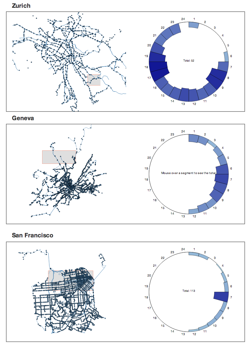
There you have it! A comprehensive, interactive visualization of three cities using reusable components!
Summary
This application serves to demonstrate the power of the reusable API. We have created a complex visualization consisting of brushing, custom events, crossfiltering, and dynamic updating, but we have done so in a way that is easily adaptable and scalable. This application could be adapted quickly to use the data from your own city. We encourage you to take the source code and try it out!